Every fall Pantone announce their colours of the year which in turn is followed by the paint companies announcing their colour of the year (COTY). Many of us look at the colours, either love them or dis them and move along. Then there are those of us who eagerly await the announcement to see what is going to inform interior design and decor for the following year.
While each company selects a main colour, they also develop a number of related palettes building off the Pantone colours that include various tones and hues of the COTY as well as coordinating and complementary colours.
http://www.elledecor.com/design-decorate/color/a9178549/pantone-colors-2018/
So just what goes into selecting the colour of the year? It is not a random selection made by a group sitting around a boardroom table colour palettes in hand. It is an extensive process undertaken by each company with consideration given to global events, architecture, technology, fashion, art exhibits, socio-economic challenges and trends, industrial developments and environmental issues. All of this information is researched and analyzed and informs colour choices.
It is clear from what has been announced for 2018 that pale pastel colours are behind us and the trend is toward more intense, bold colour - a reflection of the intense feelings and situations in society and among our communities at the present time. You will also see a movement toward interesting and playful colour combinations – think blue and orange, pale yellow and rosy hues, bright yellow and lime green and intense colours balanced with black and gold.
Metallics will also continue to play a large role in design and decor but instead of the bright shiny metallics we have seen over the past couple of years, the trend is toward more neutral metallics with translucent or pearlized finishes.
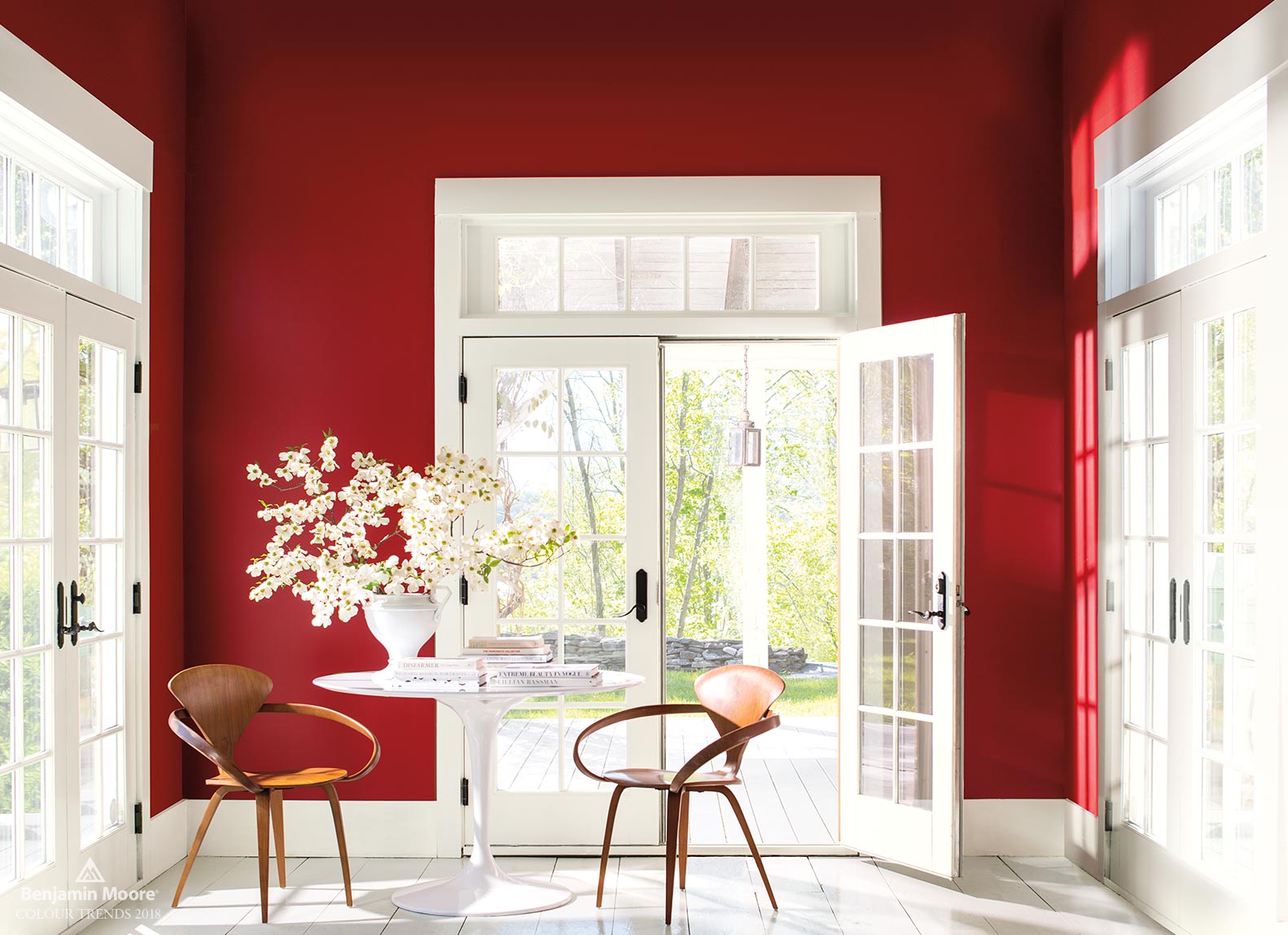
Benjamin Moore Colour of the Year 2018 - Caliente AF-290
There is a wide range of COTY from which to choose and one or more that will work well in a variety of decor styles. If a total redo of a room or rooms is not on your schedule for 2018, incorporating a COTY can be as simple as adding pillows or a colour block throw that incorporates one or more of the colours or including candles or a floral accent in one of the COTY.
With a range of colours and related palettes informing design and decor choices for 2018, there will something that speaks to each of us and will work well with the decor in our rooms. What is your fave and how are you going to use it? I look forward to seeing your choices!