Hello my design and decor loving friends! I have shared ideas, tips and tricks with you regarding paint and how to pick the exact paint colour your space needs but a number of you have had questions about pulling together colour palette. Typically we select a paint colour for the room we are updating and maybe the trim colour and that’s where it ends. Finishing the space – selecting linens, window treatments, decor, art - is done almost as an afterthought. Sound familiar?
This week I share simple steps for creating a colour palette for the space or spaces you want to update that extends beyond the paint colour. Going into a project with a palette makes it easier to:
create and envision the ambiance you want for the space
select furnishings, window treatments, linens, rugs
choose decor that pulls the look together
Read on!
1. To get started, think about the space in terms of how it will be used, who will use it, how often it will be used and the time of day. For example, if the space will be used for quiet conversation or reading, consider colours that are calm, quiet and relaxing.
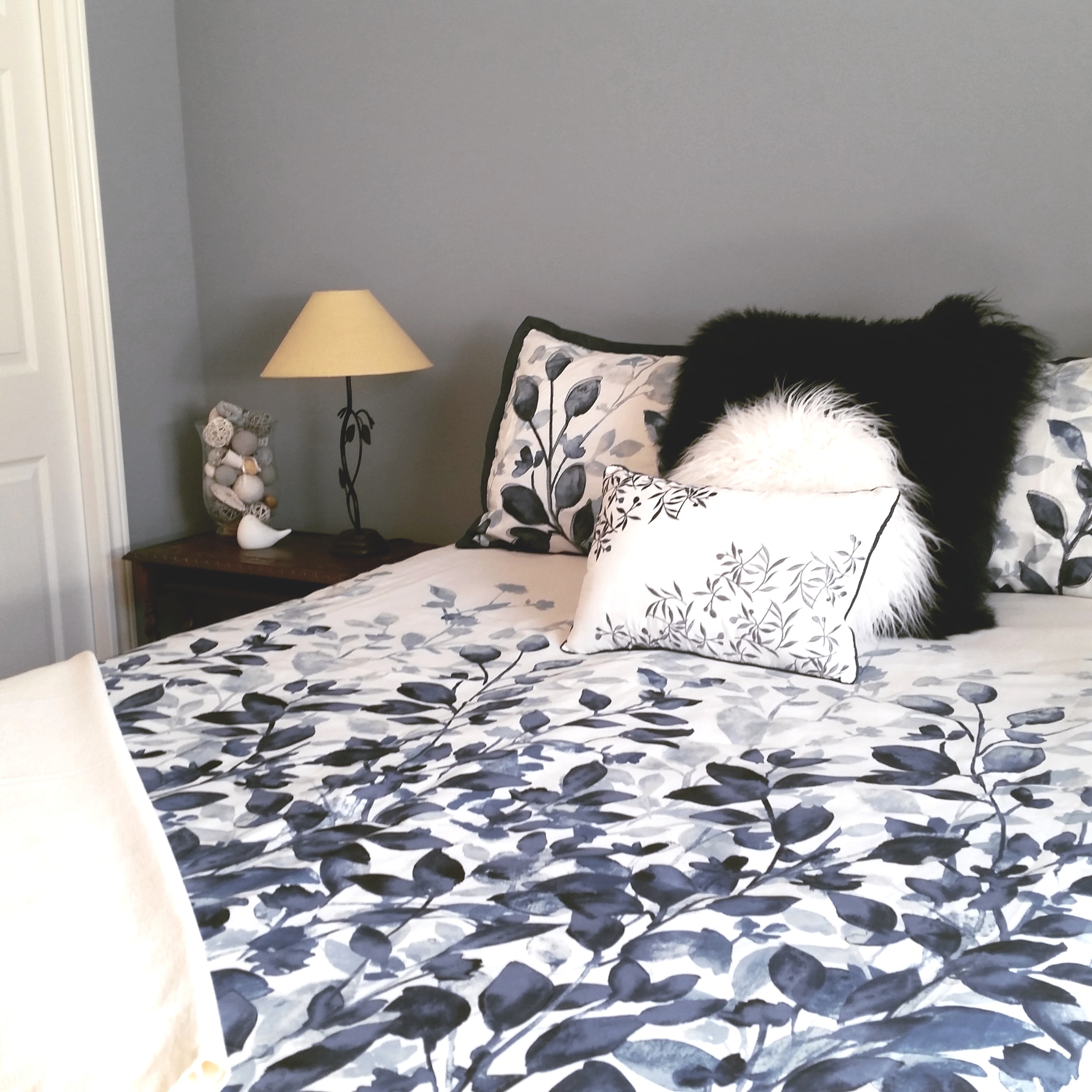
2. Select 3 colours for the space: light, medium and dark. These can be from the same colour family such as blues and grays. Or perhaps you want something a bit more playful and energetic so choose colours opposite each other on the colour wheel for example, yellow and purple or red and green.

3. Choose your pale, neutral colour for trims and ceiling. Typically this would be white but as any of you who have looked at white paint chips know there are literally dozens of white shades out there! Look for a white that will frame for your space and play well with the 3 colours you chose for your palette.


4. Once you have the colours selected, consider the space, use and amount of natural light to determine which will be your main colour and the second and third colours. John Linden of The Most Chic explains how to use the colour wheel for selecting colours in his blog post https://www.themostchic.com/complementary-color-scheme-interior-design/ .
5. As you plan the update, consider the general rule of thumb for colour proportion in your space:
60% main colour (walls)
30% secondary colour (furnishings, area rug)
10% third colour (decor accessories)
I hope these guidelines help in planning updates to your spaces and creating your ideal room. Be sure to share pics – I love to see what you’re up to!
For more design and decor inspiration, follow Simply Swank Decor on:
Facebook (https://www.facebook.com/simplyswankhomedecor/)
Pinterest (https://www.pinterest.ca/simplyswankdeco/)
Instagram (https://www.instagram.com/simplyswankdecor/